Digital dashboards for workout metrics let you analyze detailed data on your fitness journey. You'll get insights from fitness summary charts showing training distribution, peak power and pace charts highlighting performance trends, and time in zones charts for heart rate analysis. By tracking key metrics like heart rate, duration, and Training Stress Scores, you can optimize workout intensity. Performance manager charts help monitor fatigue and readiness, allowing for strategic rest periods. These tools support data-driven decisions, improving your athletic performance and providing a thorough view of your progress. Explore how these features can elevate your fitness routine.
Table of Contents
ToggleKey Takeaways
- Visualizes training distribution across seasons with metrics like distance, duration, and TSS.
- Tracks and compares performance metrics such as peak power and pace over different date ranges.
- Provides customizable heart rate zones for targeted intensity and energy system training.
- Monitors consistency by comparing planned and completed workouts to highlight adherence.
- Integrates fitness, fatigue, and form metrics for long-term performance management and race readiness.
Fitness Summary Chart
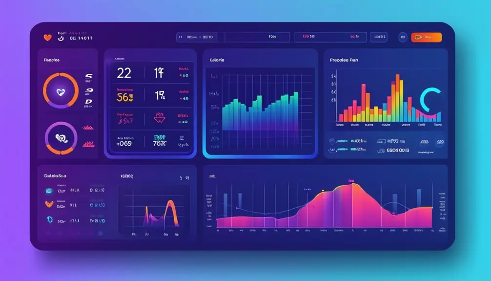
The Fitness Summary Chart provides you with a detailed overview of your training distribution across different seasons, enabling precise identification of weaknesses in specific sports. By displaying metrics such as completed distance, planned duration, and Training Stress Score (TSS), you can pinpoint exactly where improvements are needed.
Using a mobile app, you can access this chart anytime, tracking your heart rate and other essential data. Fitness apps make it easy to customize date ranges and titles, allowing you to tailor the information to your specific needs. This customization lets you see trends in your training, helping you understand whether you're meeting your goals.
Analyzing your Fitness Summary Chart provides valuable insights into your training patterns. For example, if you notice a consistent drop in your TSS during winter months, it might indicate that you need to adjust your training plan for that season. The chart's data-driven approach guarantees you're making informed decisions about your regimen.
In essence, the Fitness Summary Chart is a powerful tool in your fitness app arsenal, offering a thorough look at your performance. This enables targeted improvements and a deeper understanding of your athletic progress.
Fitness History Chart
Building on the insights provided by the Fitness Summary Chart, the Fitness History Chart offers a focused analysis of your progress in peak power for biking and peak pace for running. This chart tracks your performance over weeks and months, comparing peaks at different durations, so you can evaluate how you're improving over time.
By consolidating data in one place, the Fitness History Chart lets you easily see if you're getting faster or producing more power. This is particularly useful for preparing for goal events and tracking performance trends. Monitoring your sleep patterns and their impact on your fitness progress can also provide valuable insights.
Here's a snapshot of how your data might look:
| Week | Peak Power (W) | Peak Pace (min/mile) |
|---|---|---|
| 1 | 250 | 7:30 |
| 2 | 255 | 7:25 |
| 3 | 260 | 7:20 |
| 4 | 270 | 7:15 |
| 5 | 275 | 7:10 |
This table helps you quickly identify trends and areas needing improvement. Are you consistently increasing your peak power output? Is your running pace improving? The Fitness History Chart provides the data-driven insights necessary to answer these questions and make informed adjustments to your training regimen.
Peak Power and Pace Chart
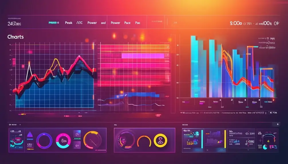
A Peak Power and Pace Chart offers a data-driven approach to compare your performance metrics over various date ranges, providing clear insights on improvements and areas needing attention. By examining your peak power and pace, you can track how your training efforts are impacting your performance. This chart is particularly useful for identifying outliers in power, pace, or heart rate, which helps you correct any data inaccuracies and confirm your metrics are reliable.
To maximize the benefits of the Peak Power and Pace Chart, consider its capacity to:
- Track Progress Over Time: Compare your current performance with past data to see improvements or declines.
- Identify Seasonal Trends: Analyze how your performance varies between different seasons, offering insights into how environmental factors affect your fitness.
- Spot Data Outliers: Quickly identify and rectify any anomalies in your data, ensuring accuracy and reliability.
For athletes, this chart is invaluable for optimizing performance. By regularly analyzing your peak power and pace, you can make informed decisions about your training regimen, focus on areas needing improvement, and ultimately enhance your overall athletic performance. Leveraging this tool allows for a nuanced understanding of your fitness journey.
Time In Zones Chart
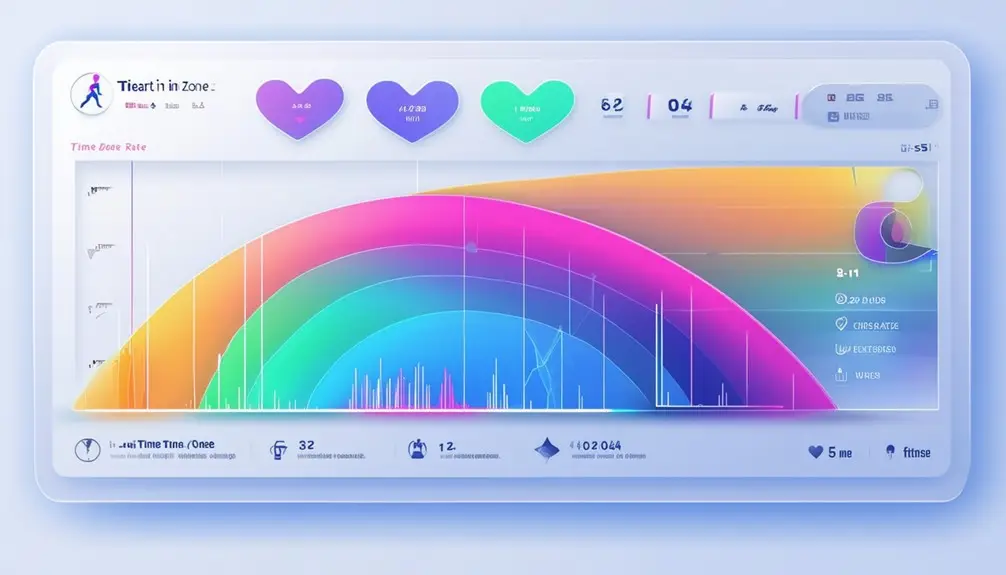
When you use the Time In Zones Chart, you can customize it for heart rate zones to guarantee you're hitting the right intensity targets. This tool supports targeted energy system training by helping you monitor and adjust your workout intensity distribution. By analyzing this data, you can optimize your efforts and avoid spending too much time in less productive zones.
Customizable Heart Rate Zones
Customizable Heart Rate Zones in the Time In Zones Chart offer a powerful tool for tracking and optimizing workout intensity. By personalizing these zones, you can monitor if you're meeting specific heart rate targets during your workouts. This allows for more precise adjustments to your training regimen, ensuring you hit your fitness goals efficiently.
Using the Time In Zones Chart, you can visualize the distribution of time spent in each heart rate zone. This data-driven approach provides a clear picture of your workout intensity levels. Here are three ways customizable heart rate zones can enhance your training:
- Personalized Training: Tailor your heart rate zones to align with your specific fitness goals, whether you're aiming for fat burn, endurance, or peak performance.
- Real-time Feedback: Gain immediate insights into whether you're exercising within your desired intensity range, allowing for on-the-fly adjustments.
- Performance Optimization: Analyze the time spent in each zone to identify areas for improvement and make informed decisions about future workouts.
Targeted Energy System Training
Building on the concept of personalized heart rate zones, targeted energy system training in the Time In Zones Chart focuses on monitoring and enhancing specific workout zone targets for Heart Rate, Pace, or Power. By doing so, you can guarantee that your training sessions are hitting the right intensity levels, tailored to your fitness goals. The chart not only tracks if you meet your specific targets but also helps you limit the time spent above certain zones, which is vital for effective energy system training.
You can customize the Time In Zones Chart to visualize your workout intensity distribution effectively. This customization allows you to see if you're consistently hitting your desired training zones, providing valuable insights into your performance. Are you spending too much time in high-intensity zones and not enough in recovery zones? The chart can answer that for you. It provides a clear evaluation of whether you're training within your targeted zones, making your workouts more efficient and goal-oriented.
Using this data-driven approach, you can make informed adjustments to your training regimen, ensuring peak performance and progression. The insights gained from the Time In Zones Chart empower you to train smarter, not harder.
Workout Intensity Distribution
Analyzing workout intensity distribution through the Time In Zones Chart provides actionable insights into how effectively you're meeting your training targets. This chart monitors whether you're hitting your zone targets for heart rate, pace, or power, giving you a clear picture of your training intensity distribution. By tracking the time spent in each zone, you can verify you're targeting specific energy systems efficiently.
Utilizing the Time In Zones Chart offers several key benefits:
- Optimized Training: By limiting the time spent above certain zones, you can prevent overtraining and better focus on the desired energy systems.
- Customization: The chart can be tailored to your individual training goals, allowing you to track progress and make necessary adjustments.
- Performance Evaluation: Consistent monitoring helps you evaluate the consistency and intensity of your workouts, leading to improved performance outcomes.
When you customize the chart, it becomes a powerful tool that aids in optimizing your training regimen. You can track and adjust your workouts to meet specific zone goals, verifying you're exercising at the right intensity levels. This data-driven approach helps you refine your training, verifying every session contributes effectively toward your overall fitness objectives.
Completed Distance Chart

The Completed Distance Chart lets you visualize your workout performance clearly, showing how your actual distances stack up against your planned ones. By identifying patterns in your training consistency, this tool helps you make data-driven adjustments to your goals. You'll gain insights into your progress, ensuring you stay motivated and accountable.
Visualize Workout Performance
A Finished Distance Chart offers a data-driven perspective on your workout performance, showcasing the difference between planned and actual distances to highlight areas of improvement or overachievement. This tool is pivotal for athletes aiming to fine-tune their training strategies. By visualizing your completed vs. planned distances, you can quickly identify patterns in your performance.
Here's how a Finished Distance Chart can enhance your workout regimen:
- Goal Reevaluation: Spotting overachievement or missed workouts allows you to reassess and set more realistic goals.
- Confidence Boost: Seeing tangible evidence of your efforts can notably boost your confidence and motivation.
- Clear Overview: A detailed view of your completed distances helps you stay aligned with your fitness objectives.
The chart is not just a visual aid; it's an analytical tool that provides insights into your training consistency. It enables you to track your progress over time and facilitates meaningful discussions with coaches or trainers about your performance. By consistently using this chart, you can adjust your routines to optimize performance, ensuring you're always on the right path toward achieving your fitness goals.
Identify Training Consistency
You can quickly identify training consistency by comparing your completed distances against your planned workouts using a Completed Distance Chart. This chart provides a clear visualization of your workout adherence, highlighting any missed sessions or instances of overachievement. By examining this data, you can easily spot trends in your training routine, allowing you to make informed adjustments as needed.
The Completed Distance Chart serves as a powerful tool for reevaluating your fitness goals. If you notice a pattern of missed workouts, it might be time to reassess your plan and set more achievable targets. Conversely, consistently exceeding your planned distances can boost your confidence and indicate that you're ready to elevate your training regimen.
Additionally, this chart is invaluable for discussions about your training consistency and overall progress. It offers a detailed overview of your workout distribution, helping you and your coach pinpoint areas that need improvement. By maintaining a balanced and consistent training schedule, you're more likely to achieve long-term success in your fitness journey.
Tracking Key Metrics
Tracking key indicators on digital dashboards allows you to gain insightful, data-driven views into your fitness progress by monitoring heart rate, distance, duration, and training stress scores. These dashboards offer a visual representation of your workout data over time, which allows you to identify trends and pinpoint areas for improvement. Customizing date ranges and titles helps you focus on specific training periods or goals, making sure you're always aligned with your fitness objectives.
Monitoring these key indicators provides several advantages:
- Heart Rate Monitoring: Keeping track of your heart rate helps you gauge workout intensity and make sure you're training within ideal zones for maximum efficiency.
- Distance and Duration: Tracking how far you've run and for how long gives you a clear picture of your endurance and stamina over time.
- Training Stress Scores: Analyzing training stress scores helps you understand the overall load and recovery needs, preventing overtraining and promoting balanced fitness progress.
With indicators like peak power, peak pace, and time in zones, you gain a detailed overview of your performance. By analyzing these indicators, you can make informed decisions to optimize your training routine and achieve your fitness goals more efficiently.
Performance Manager Chart
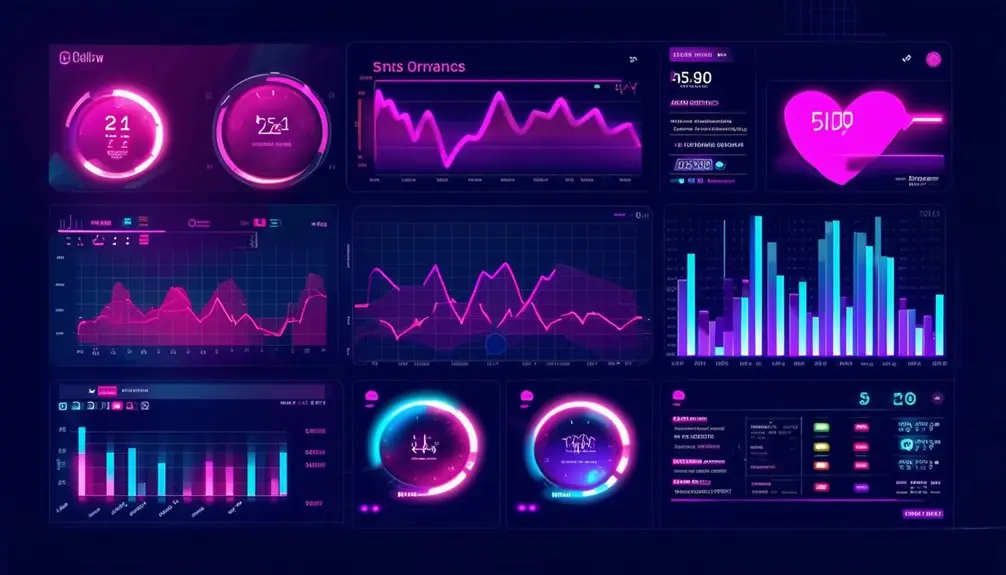
While tracking key metrics is fundamental for understanding your daily fitness progress, the Performance Manager Chart offers a more all-encompassing view by integrating frequency, intensity, and duration to monitor your long-term Fitness, Fatigue, and Form metrics. This chart doesn't just show isolated data points; it visualizes your entire season's story, helping you plan rest periods and gauge race readiness with precision.
By forecasting Fitness, Fatigue, and Form based on your Training Stress Score, the Performance Manager Chart enables you to make data-driven decisions for better performance management. This forward-looking approach is essential for avoiding overtraining and ensuring you're peaking at the right times.
For multisport coaches, this tool is invaluable. It allows you to dissect the contributions of individual sports, optimizing training plans to balance workload and recovery. The comprehensive view provided by the Performance Manager Chart helps you achieve those elusive peak performance levels by aligning your training with your body's needs.
In essence, the Performance Manager Chart serves as a sophisticated guide, turning complex training data into actionable insights, thereby enhancing your ability to reach your fitness goals efficiently and sustainably.
Advanced Dashboard Features
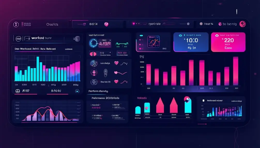
Advanced dashboard features offer a detailed toolkit for analyzing workout metrics in a way that's both enlightening and actionable. By leveraging performance manager charts, time in zones charts, and fitness history charts, you can gain an extensive understanding of your training dynamics. These tools allow you to track key metrics such as peak power, peak pace, completed distance, and duration, providing a nuanced view of your performance.
To make the most out of these features, consider the following benefits:
- Customizable Reports: Tailor reports and visualizations to highlight specific performance areas, helping you and your coach make well-informed decisions.
- Holistic Training View: Get a complete picture of your training distribution, trends, and improvements over time, allowing for better strategy adjustments.
- Actionable Insights: With data on various metrics affecting performance, you can pinpoint areas needing improvement and track progress effectively.
Utilizing advanced dashboard features not only enhances your ability to monitor and understand your workout metrics but also empowers you to make data-driven decisions. This ultimately leads to more efficient training sessions and improved athletic performance. So, don't overlook the power of these tools in your training regimen.
Frequently Asked Questions
What Is the Best Metric for Fitness?
You can't pinpoint a single best fitness metric since it depends on your goals. Analyze heart rate, calories burned, distance, and duration. Track progress to find what's most effective. Consult a fitness pro for personalized insights.
How to Keep Track of Your Workouts?
Picture yourself running through a scenic trail, each step tracked seamlessly. You can keep track of your workouts by using apps that log distances, heart rate, and performance metrics, providing insightful, data-driven trend analysis to improve your training.
Is There an App to Track Workouts?
Yes, there are multiple apps to track workouts. Nike+ FuelBand, Fitbit, BodyMedia, MapMyFitness, and Digifit all offer sophisticated dashboards, combining motivational design, detailed metrics, and user-friendly interfaces to enhance your fitness tracking experience.
How to Design a Digital Dashboard?
To design a digital dashboard, prioritize user experience and engagement. Use contemporary design elements, bright colors, and smart icons. Guarantee simplicity and effective data visualization. Integrate motivational features to keep users active and tracking progress.
Conclusion
Just like a lighthouse guiding ships through foggy waters, digital dashboards illuminate your fitness journey, offering clarity and direction. By tracking key metrics and analyzing performance charts, you gain actionable insights to navigate your workouts efficiently. These advanced features aren't just tools; they're your compass, ensuring every step and stroke leads you closer to your fitness goals. Embrace the data, let it guide you, and watch your performance soar to new heights.


